OK, let’s get the whining out of the way first: I want to unreservedly love the new pinstripes, but they annoy me a little.
The Mets were born in the Jet Age. Fatherly Eisenhower had given way to hip, stylish JFK, soon to announce we were going to the Moon. The Mets set up shop in the Polo Grounds, squashed into a grid of urban streets and thick with the ghosts of Giants past, but that was a temporary arrangement. They were headed for Shea, then a standard bearer for futuristic ovals equally suited for football and baseball and even mop-topped British invaders. Shea was located right by the wonders of the World’s Fair, ringed by parkways fit for bearing Robert Moses’ sojourners from the suburbs in their sleek new automobiles.
We’d change our mind about how much we liked some of that new world, but that’s not the point. The point is that the uniforms should be white. The Mets’ blue and orange caps were nods to the departed Dodgers and Giants, but beyond that, the team wasn’t a sepia-tinged nostalgia exercise. They were the team of the future, and their uniforms were as bright as that future was deemed to be. Don’t be fooled by vintage uniforms on display — they’ve yellowed with age, just like old letters do. Look at old photos, or at Topps baseball cards. The Mets’ uniforms should be white, not off-white or cream or beige or ivory or buff or vanilla or what-have-you. (If Paul Lukas wants to tell me I’m wrong, I’ll listen. Otherwise, I’m not.)
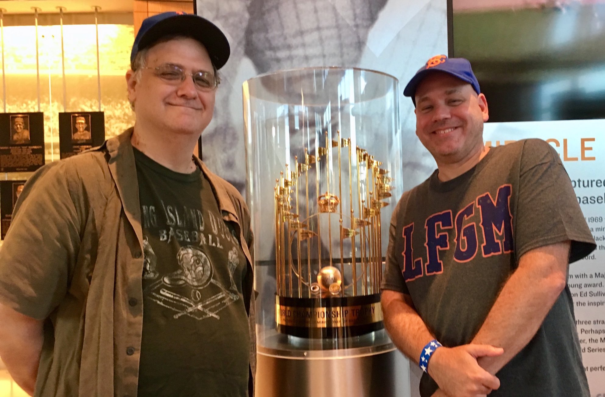
But I’m done whining. Because everything else the Mets unveiled Wednesday, with the other half of Faith and Fear in attendance, was great. The glass, for once, is 95% full.
The Mets and I might argue about the proper Pantones for those pinstripes, but the most important thing is that they’re back in heavy rotation, which is baseball like it oughta be. Shorn of those trying-too-hard black drop shadows, the script Mets looks properly bright and lively, unfussy and optimistic. (I’m equally glad that they lack the racing stripe. If the Mets hadn’t won a championship wearing those things, they’d be understood as the sartorial equivalent of disfiguring “Meet the Mets” with the roll call for “Long Island, New Jersey….”)
The rest of the news was good too. The pinstripes will be joined by the home whites, also boasting additional impact thanks to the subtraction of shadows, and the solid black tops, which I don’t mind for cameos. The road uniforms shown yesterday are similarly classic: gray with blue piping and the simple, shadowless stenciled NEW YORK. On top of that, word is that those the hideous two-toned black-and-blue caps have gone down the memory hole, joining ice cream caps, Bicentennial pillboxes and Mercury Mets lids in never being discussed again. The caps will be solid blue (with orange buttons — a change I actually liked) or solid black.
All of this isn’t just encouraging or a step forward or great — it’s smart, respectful and fan-friendly.
Kudos, too, for the Mets’ 50th anniversary logo. (But wait a minute, wasn’t last year the 50th anniversary season? Whatever. I never could do math.) Not so long ago, the Mets moved into Citi Field with an inaugural-season patch that looked like a Citibank intern had slapped it together using Microsoft Paint before a smoke break. This is so much better — a respectful update of the skyline logo.
Oh, and the Mets did all this without a single shot fired at their own feet. The announcement came on the 50th anniversary of the unveiling of the original logo, the kind of anniversary that has too often has been noticed by fans instead of by the front office. And it came with another fan-friendly gesture — Banner Day is returning.
Banner Day began as New Breed samizdat and flourished as a very Metsian holiday before being sadly banished. It’s great to have it back. The Mets of recent years have often seemed so hypersensitive to the possibility of bad PR or media scoffing that they’ve ignored their own history and muzzled their own fans; resurrecting Banner Day is a welcome sign that the team wants to rebuild that connection. Here’s hoping fans respond in kind, ignoring the current dark clouds. Let’s get this established right now: It would be rude, graceless and self-destructive for fans to make Banner Day 2012 an Occupy Citi Field parade of Wilponzi sloganeering, I’m Calling It Shea revanchism and howls for Reyes revenge, should the worst come to pass.
Heck, the Mets even brought out Ike Davis as one of the uniform models — a crutch- and boot-free Ike Davis who sounded like he was ready to play two.
Could yesterday have been better? Sure, I guess — the Mets could have made the pinstripes white and the home “whites” cream, then trotted out Jose Reyes as a surprise addition as one of the models, with Greg texting me excitedly that Jose Jose Jose was holding a press release about a Madoff settlement in one hand and a new contract in the other. But by those standards you’ll always want more. When a big day is 95% of what you would have asked for, that’s pretty good. In fact, it’s better than pretty good. You might even call it amazin’, amazin’, amazin’.


As much as I love the new 50th patch I miss the intertwined NY that used to be on it. I am loving the announcements that came out but dreading the one to be made about Reyes. Hoping for the best, expecting the worst.
I’m all for the celebrations of the past. It’s great to hear positive Met news on a gloomy November day.
But I couldn’t help but think that, for the most part, the new 2012 uniforms are basically the re-launch of the 1995 uniforms sported by Hundley, Harnisch, Huskey and Gilkey. To those of you who have the 1995 Met yearbook (with the woodgrained Met logo on the cover), turn to page 54 and have a look for yourself.
Hi Jason,
“The Mets were born in the Jet Age.”
“The Mets set up shop in the Polo Grounds.”
Hi Jason,
Wouldn’t be a subliminal message about hoping the Jets bounce back when taking on Denver tonight?
Also hope that the return to the old uniform isn’t the only thing that will look good at Citi Field next year.
Joe
Since the Jets occupied the Polo Grounds before the Mets were born and went with them to Shea?
Ex-Dodgers/Mets Chin-lung Hu: Takes a Breather from MLB to Bite in Australian Baseball League http://wp.me/p1WQwV-8P
[…] Faith and Fear says the changes are almost perfect (the last paragraph is a thing of beauty). […]
I would say more like maybe 60% half full. The new logo is okay, I like the bridge – maybe the 50 could have been superimposed over the existing logo? As far as the other anouncements, I think Dave Howard stumbled through it – especially when a NEWSDAY writer asked if the 50th anniversary promos were a distraction from other problems in the organization. This made for a rather awkward press conference and it seemed be swept in negativiity.
I love the idea of Banner day coming back, but confused by the use of “Mets Alumni”. There will be no oldtimers day and he was not specific about the use of the alumni during the 50th anniversary season. He also continuously advised more details would be forthcoming with other promo announcements. This reminded me of the last STAR TREK movie with Shatner where nearly everything on the new ship wouldn’t be installed until….’Tuesday’.
I,m sure it will be terrific despite the academics..I love the idea of it..
Rich P
Sorry folks, but I simply cannot derive any joy from this 95%. It’s window dressing for what will be a dismal 2012, and possibly 2013. I will be shocked, but overjoyed if Reyes is retained, but even his return will not save this current mess Manaya, Wilpon and Madoff have left us in.
Just saying.
[…] retraction of distant fences. I don’t mean that to be cynical — I think the first two are great ideas and the third is worth a try. Distractions in the service of worthy causes can be good […]