Here’s another sign of spring for you: 2010 Topps Baseball is out.
I know, it’s February. That’s the way things go these days — the first series of cards arrives in the dead of winter, weeks before anyone even shows up in Florida or Arizona, with a couple of cup-of-coffee rookies adorning their first cards (Tobi Stoner has now made his Topps regular-series debut) and a couple of old veterans appearing on Mets cards when they’re no longer Mets. (Sorry, Mr. Delgado.) There will be a second series in the spring, followed by the traded set in the fall, and then the cycle will begin again.
 This year’s cards are pretty nice, at least to my eyes: prominent Mets logos and cards in Met colors. (I still can’t get over that in 1976, the first year I collected, the Mets cards came in Michigan colors.) And even though there’s snow on the ground, it’s great to be able to momentarily glimpse the coming baseball summer through a little cardboard window. Flipping from Daniel Murphy’s 2009 stats back to his picture on the front, you realize spring isn’t so far away and you’ll probably make it, yet again, through the Super Bowl and the tail end of another cruel winter to the promised land of pitchers and catchers.
Still, there are odd things afoot this year. Major League Baseball has now reduced the number of card makers to one — Topps — echoing the monopoly of years past. Upper Deck is still in the game, but won’t be able to use team logos, which I suppose means it will issue cards that look like the pictures of players you used to find on wiffle-ball cartons, or the cards Topps would produce for guys who’d changed teams, with blank caps or no caps at all. (The term for the latter is BHNH — “big head no hat.” More on this in a bit.)
From the highly parochial perspective of The Holy Books this is bad news: In recent years Upper Deck did a public service by rounding up cards for the lesser lights of baseball rosters, and without competition I doubt Topps will worry overmuch about immortalizing fourth outfielders and middle relievers. From THB’s roster of 26 2009 Mets, Upper Deck was responsible for Casey Fossum, Andy Green, Pat Misch and Darren O’Day — not guys you’ve thought of much since Game 162, but Mets nonetheless.
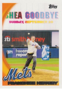 Speaking of which, 2010 Topps Series I brought new THB cards for Angel Pagan, Gary Sheffield, Fernando Martinez, Josh Thole and Stoner. Thole is an annoyance, though — he’s no longer an Eastern League All-Star, but now he’s stuck with a dreaded horizontal card. Still, at least that’s better than the franchise-history card Topps stuck the Mets with: It’s Tom Seaver tossing the closing pitch under the SHEA GOODBYE banner.
No disrespect to the Franchise or the Mets’ old home, but really? That’s the image that sums up the franchise? An old player in a phony antique jersey bidding farewell to a concrete doughnut after a soul-killing loss that left fans near suicide? I suppose it’s a better fit than we’d like to admit, but can’t the positive be accentuated in a situation like this? Why not young Seaver’s knee scraping dirt? Jerry Koosman jumping into Jerry Grote’s arms? Tug McGraw slapping his glove against his knee? Ray Knight with his hands on his helmet in happy disbelief? Jesse Orosco putting his glove in orbit? Todd Pratt hoisting Robin Ventura aloft? I haven’t seen the rest of the set, but I won’t be surprised to discover that the Yankees’ franchise-history card documents Yogi Berra descending to the surface of the Moon or Derek Jeter capturing Osama bin Laden.
Speaking of franchise history, recently Mets Guy in Michigan and the Crane Pool Forum collaborated to uncover an interesting sidelight to an oddity of Mets baseball cards. There are no 1972 and 1973 Topps cards for Rusty Staub, apparently because of a contract dispute. But Staub is featured on one of the most horrifying-looking cards in Met history — a late 1970s Hostess card in which he bears an awkwardly repainted “Mets” batting helmet. (Follow either link to see it.)
 Ugly, but not exactly surprising: As MGIM chronicles nicely, lots of players from the 1960s and 1970s wound up with their new team allegiances achieved through added pinstripes, awkwardly changed colors and repainted caps. What vaults the Staub card into the ranks of the truly grotesque is that the Expos logo is still very visible on his uniform, and his added Mets pinstripes peter out in the vicinity of his right shoulder.
The theory advanced on the Crane Pool Forum feels right: This is an unused Topps photo from the early 1970s, when Staub was an Expo, that was converted into a Met card but never used until it was handed over to Hostess. The visible Expos logo and missing pinstripes? You can see them (or not see them) because Hostess didn’t crop the photo tightly, as Topps would have done. Tighten the crop, add in a 1972 Mets overlay and RUSTY STAUB in ’72’s font, and you have what very probably would have been Staub’s 1972 card. It makes perfect sense, and it’s immensely satisfying to see.
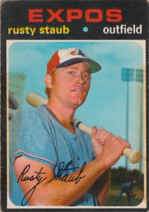
I don’t have that card, though I’m tempted to make one of my own. But I did recently get another oddball card: an alternate Rusty Staub card from 1971, before his falling-out with Topps. This one was put out in Canada by O-Pee-Chee, which used alternate shots of some Expos and added some other Montreal players to the checklist for the purposes of their domestic market. Like the reconstructed ’72 Staub, looking at my alternate ’71 Rusty gives me a little chill: A card that had escaped me exists, and for a moment I feel like a little kid pausing halfway through a wax pack to gaze at the latest treasure — a ’76 Tom Seaver, say, or even a ’77 Mike Phillips — he’ll be able to display in the neighborhood, and love until the corners are round.
And it’s not even a horizontal.




Thanks for the shout-out! You’re very kind. And I was unaware of that 1971 O-Pee-Chee.
But I must confess that I love the Seaver card from the 2010 set. My favorite ballpark with my favorite player — I can’t find too many faults with that.
Dave
Based on this from Oakland regarding another onetime Met in the Hall of Fame, it appears Topps is celebrating franchises celebrating their history. I’m just thrilled the Mets managed to do so in front of the cameras.
Long live the concrete doughnut.
But did they have to get the free credit report.com sign in the background?
Yes, 1972 and 1973 were the 1st years I collected Topps cards in earnest, and the absence of a Rusty Staub from both of those sets was endlessly frustrating. He returned to the Topps fold with a standing-on-deck shot in 1974, and a follow-through upper-cut BP photo in the psychedelic ’75 set. Then he was off to Detroit.
Although it’s true Rusty did not have an official Topps card from 1972-73, I believe he does clearly appear on the late Tommie Agee’s (horizontal) 1973 card. Centerfielder Agee is camped under a fly ball, two hands ready (ahem, Mr. Castillo). 2B Ken Boswell and Rightfielder Rusty appear to be trotting in with the third out about to be made. We can tell it’s Rusty because of that slugger’s physique, and those high stirrups. Never mind that the blue portions of the three Met uniforms were airbrushed red, since Tommie had been dealt to the Houston Astros for Rich Chiles.
Yep, this is true. One of the more comical Topps paintover jobs from an era with no shortage.
You loved Rusty Staub so much, your dad and I forged his autograph on the baseball glove we gave you for your birthday (eighth? ninth?)by burning it into the leather with a woodburner.
Yes you did, and I was never the wiser. Rusty will probably sue us now.
Ha-Ha!. Your mom likes you!